3.9 KiB
Table Data
?> GitPitch widgets greatly enhance traditional markdown rendering capabilities for slide decks.
The table widget renders comma-separated and tab-separated file data as tables on any slide.
Widget Paths
All paths to table data files specified within PITCHME.md markdown must be relative to the root directory of your local working directory or Git repository.
Widget Syntax
The following markdown snippet demonstrates table widget syntax:
@table[property...](path/to/data.csv)
?> The properties... list expects a space-separated list of table property values.
Table Properties
The table widget supports the following table specific properties:
Basic Usage
The following markdown snippet demonstrates table widget basic rendering:
@table[](path/to/sample.csv)
This sample markdown snippet renders as follows:
Data Headers
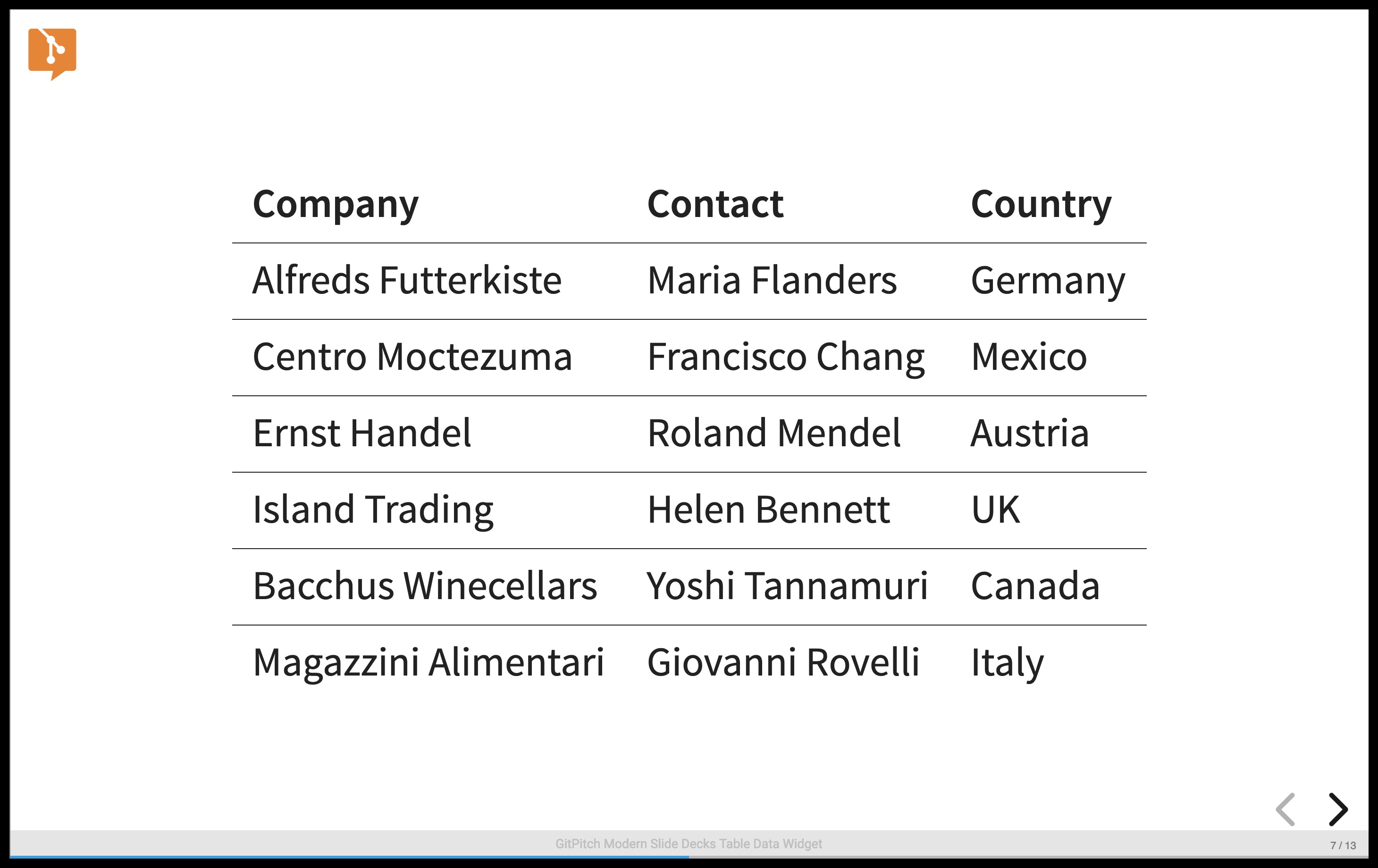
The first row in a comma-separated or tab-separated data file may contain header information. If your data file contains header information activate the built-in table-header property on your table widget as follows:
@table[table-header](path/to/sample.csv)
This markdown snippet renders as follows:
You can further customize the appearance of table headers and rows using Custom Table Styles.
Data Fragments
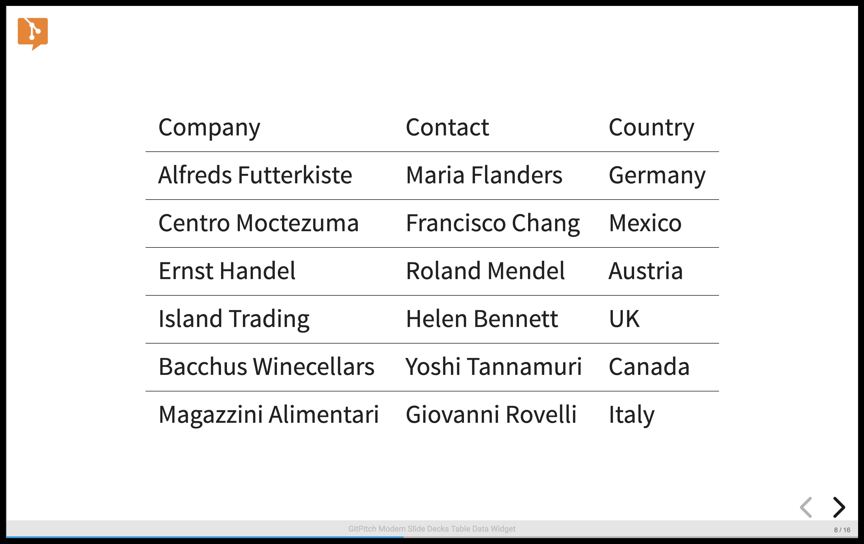
When you need to introduce each row of data in your table step-by-step activate the built-in table-fragment property on your table widget as follows:
@table[table-header table-fragment](path/to/sample.csv)
This markdown snippet renders as follows:
Tabbed Data
By default, the table widgets expects comma-separated values in your files. If your data file uses tab delimiters instead, activate the built-in table-tsv property on your widget as follows:
@table[table-header table-tsv](path/to/sample.tsv)
This markdown snippet renders as follows:
Custom Styles
To activate custom table styles for your table widget data you can define custom CSS styles and then activate those styles as properties on your widgets. For example, see the following sample custom CSS style rules:
table.custom-header th {
  font-variant: small-caps;
}

table.custom-row tr:nth-child(even) {
  background-color: #f2f2f2;
}

table.custom-spacing th, table.custom-spacing td {
  padding: 15px;
}
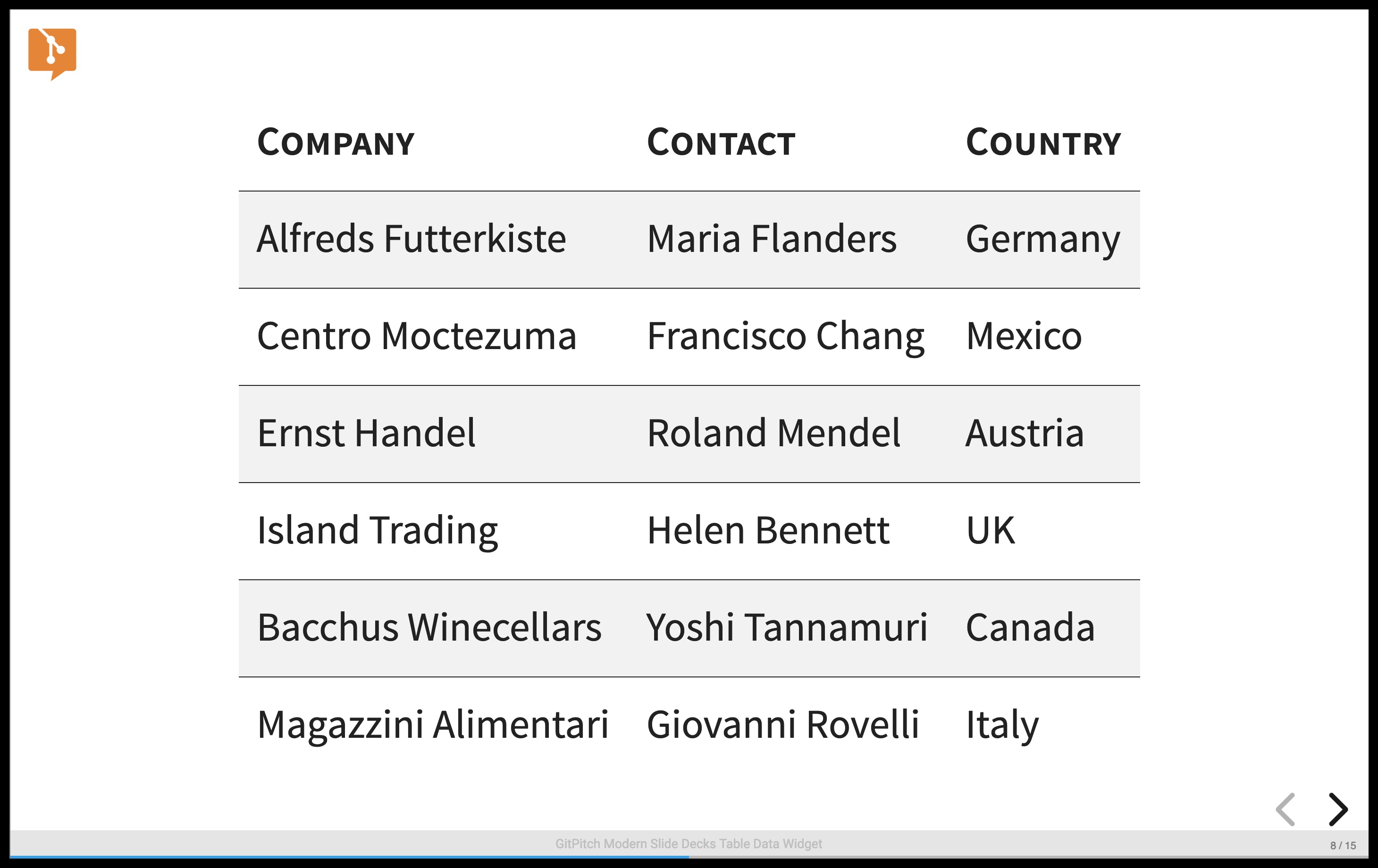
These sample custom styles rules are designed to modify the appearance of a table as follows:
- Table headings are rendered using a small-caps font variant.
- Table rows are rendered using alternating striped backgrounds using custom color.
- Table header and table data padding is set to a custom 15px size per style rule.
These custom CSS style rules can be activated as properties on a table widget as follows:
@table[table-header custom-header custom-row custom-spacing](path/to/sample.csv)
This markdown snippet render as follows:
The use of custom CSS style rules to customize the appearance of tables generated by the table widget is entirely optional. Default table styling is determined by the base theme for your slide deck.


